Behind the Brand | Matere Studio
)
Can you give an introduction to who you are and who/what your brand is and how long your brand has been around for? Is this your first Top Drawer?
My name is Jess Howard and I launched Matere in February 2021, so the brand is still less than a year old. Matere [pronounced Mat-Air] offers are range of understated, tactile and sustainable stationery, intended to encourage more purposeful, special moments in everyday life.
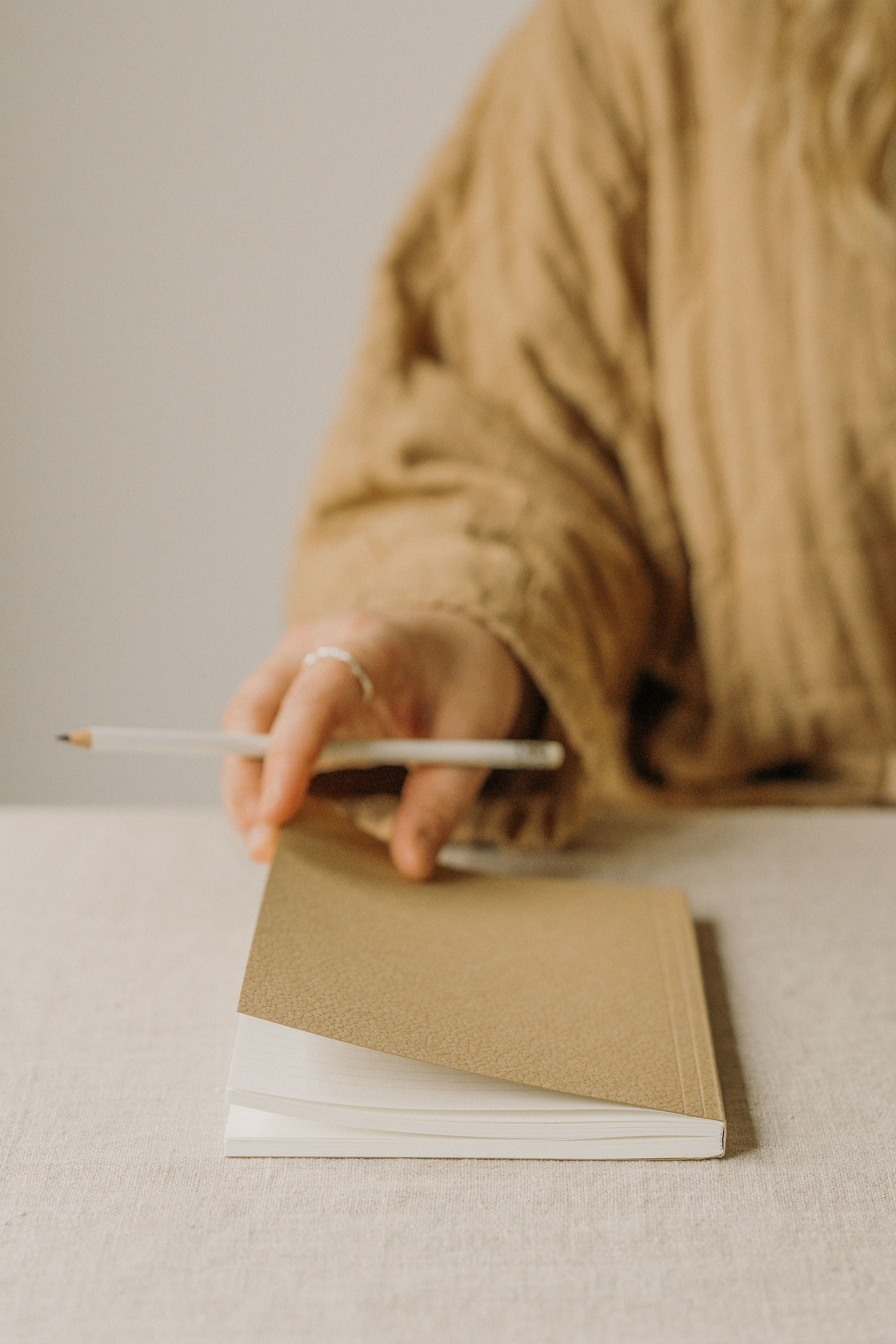
The collection includes a set of layflat notebooks, planners and wall prints designed by myself in London and is made in the UK. With sustainability at the forefront, I chose to use papers that are sourced using traceable sustainable forestry and I focus on finding recycled materials for the collection - such as leather offcuts retrieved from tanneries, plastics removed from the ocean, spent grain from breweries or recycled coffee cups collected from cafes around the UK.
This will be my first visit to Top Drawer, so please do come and say Hi if you’re near the New Brands area. I will be at stand B59.
How did you start your brand?
Matere’s inspiration is rooted in my own experiences of living and working in London as a Graphic Designer. Spending long days at a screen or rushing around the city, I sought out places, experiences and products that felt highly considered, calming and special. This came in the form of thoughtful, beautiful design, minimalism and the ‘slow living’ philosophy. When freelance work suddenly came to a halt with the pandemic, I unexpectedly found myself with time to explore harnessing this effect in my own way. I looked towards my love for both print design and unique materials - stationery was a natural fit.

What’s been your biggest highlight whilst creating your brand? Why is it you love what you do?
The most rewarding part of the process has been finding people who share my values and who love the collection and truly enjoy interacting with it. When a customer remarks on how special it feels to unbox or use a product I have created, I honestly couldn’t be happier.
Any personal favourites from your new collection?
It’s tricky to choose just one, but if I had to, I would say the Kyoto print layflat notebook is a favourite. The cover design was created using foliage from my garden in South London, which was dipped in calligraphy ink to form the artwork. The recycled coffee cup cover paper is also beautifully textured and feels great to hold.

